Route
Defining the problem
Designing the solution
We built a modular, component-based design system that became a single source of truth for our product and engineering teams. By standardizing typography, spacing, and interactions, we reduced design debt while ensuring a cohesive experience. Our documentation prioritized usability—giving designers and developers the tools to create with confidence and speed.
SORRENTO
BLUE
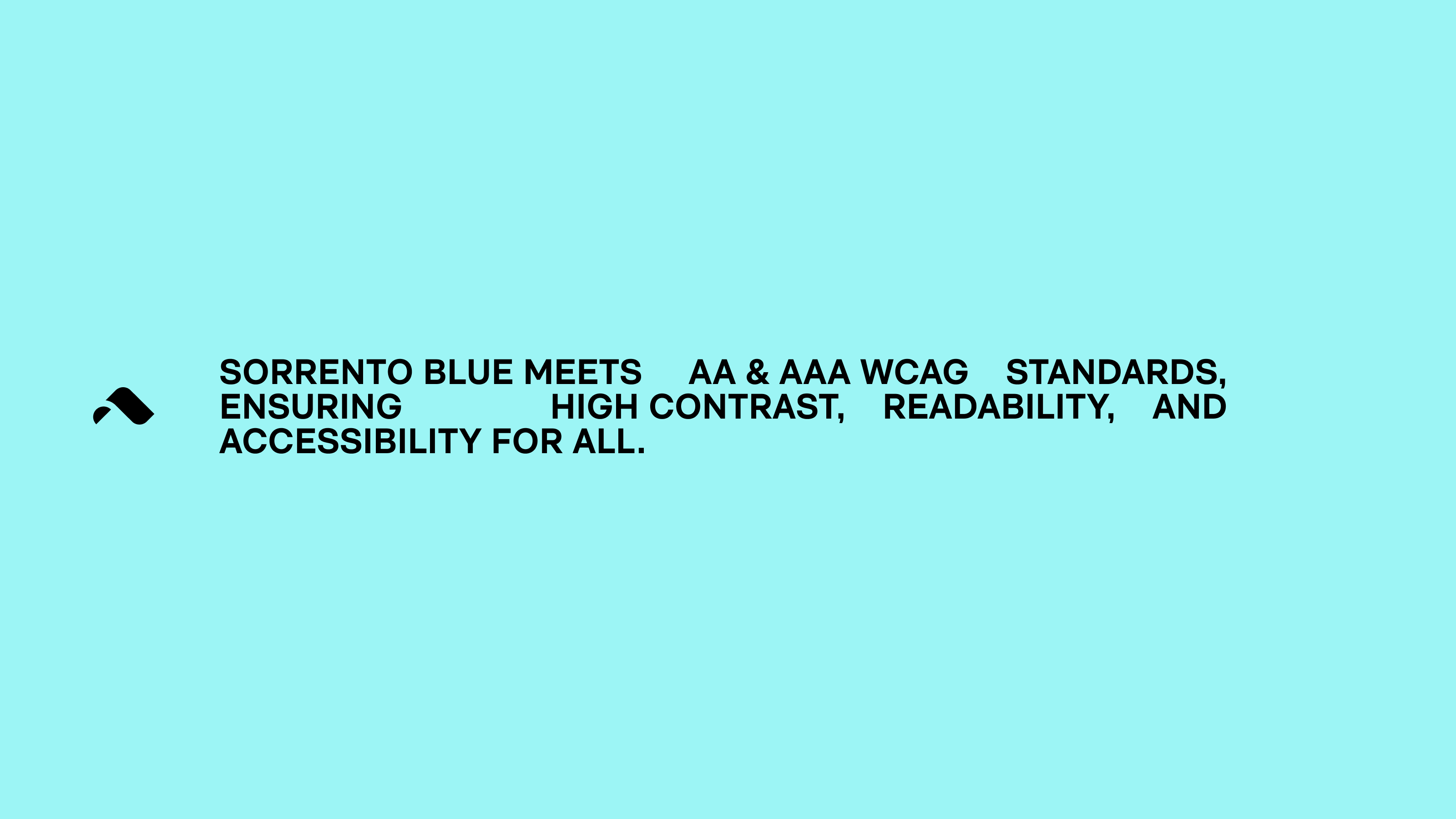
Color
Inspired by the Italian coastline, Sorrento Blue captures the spirit of travel, adventure, and open horizons. Vibrant yet grounding, it reflects the energy of movement and discovery—because every route tells a story.
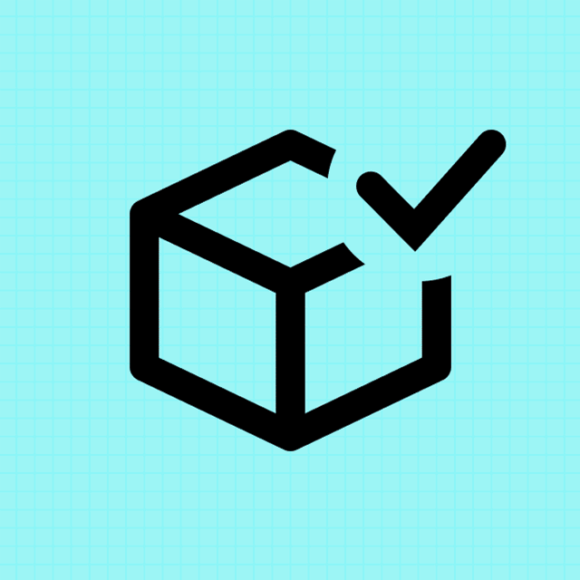
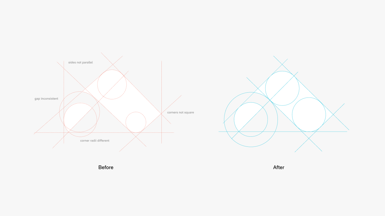
Elements & Layout
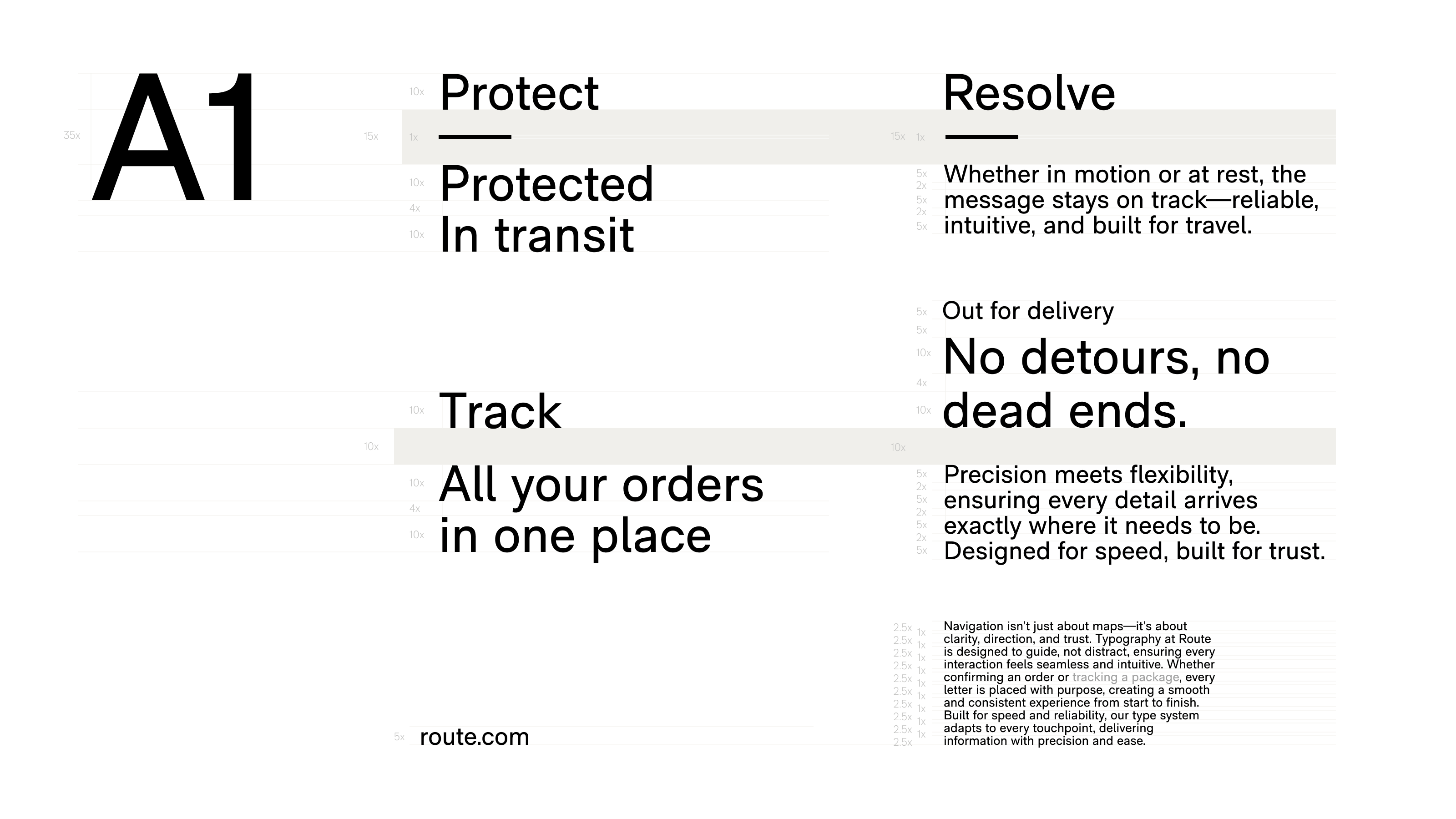
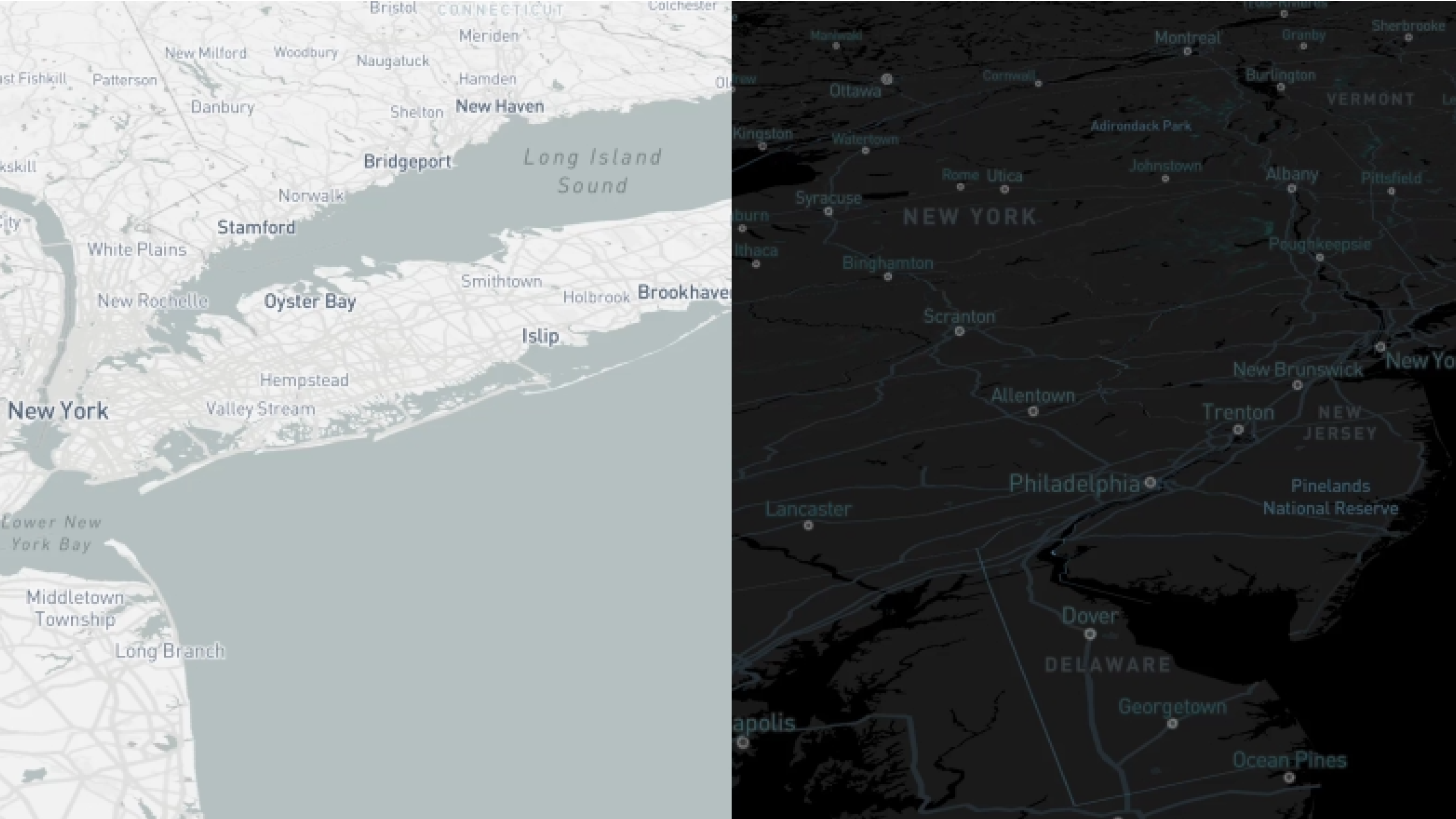
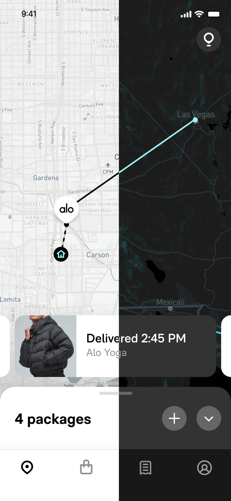
Every element is designed for clarity, consistency, and scalability. Optimized for both light and dark modes, our icons maintain sharpness and accessibility across all sizes and screens. Simple, intuitive, and unmistakably Route.
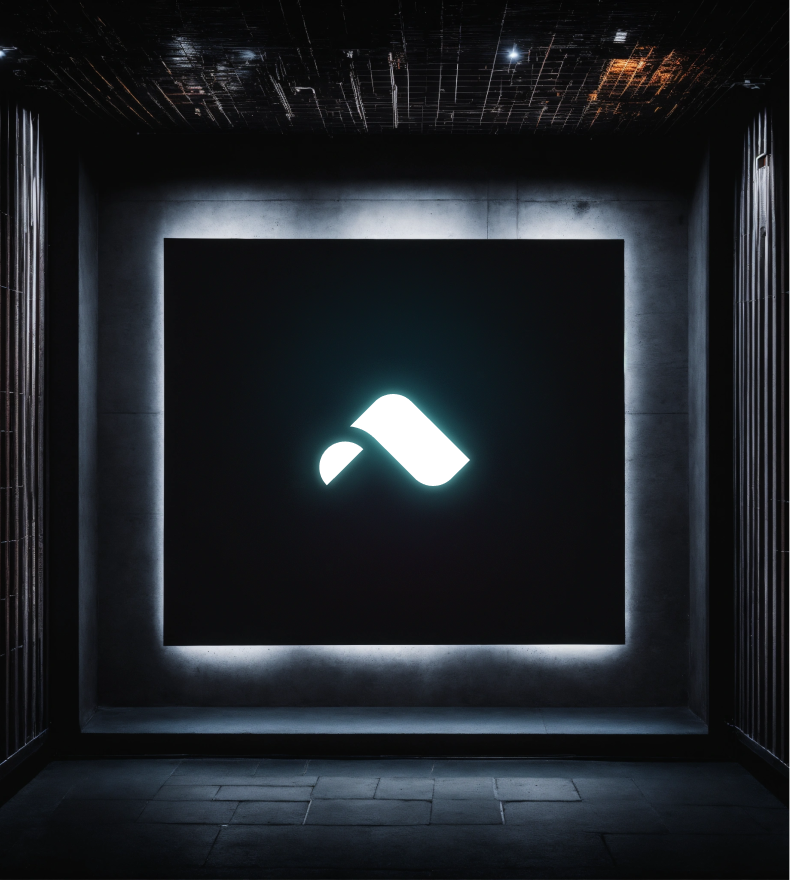
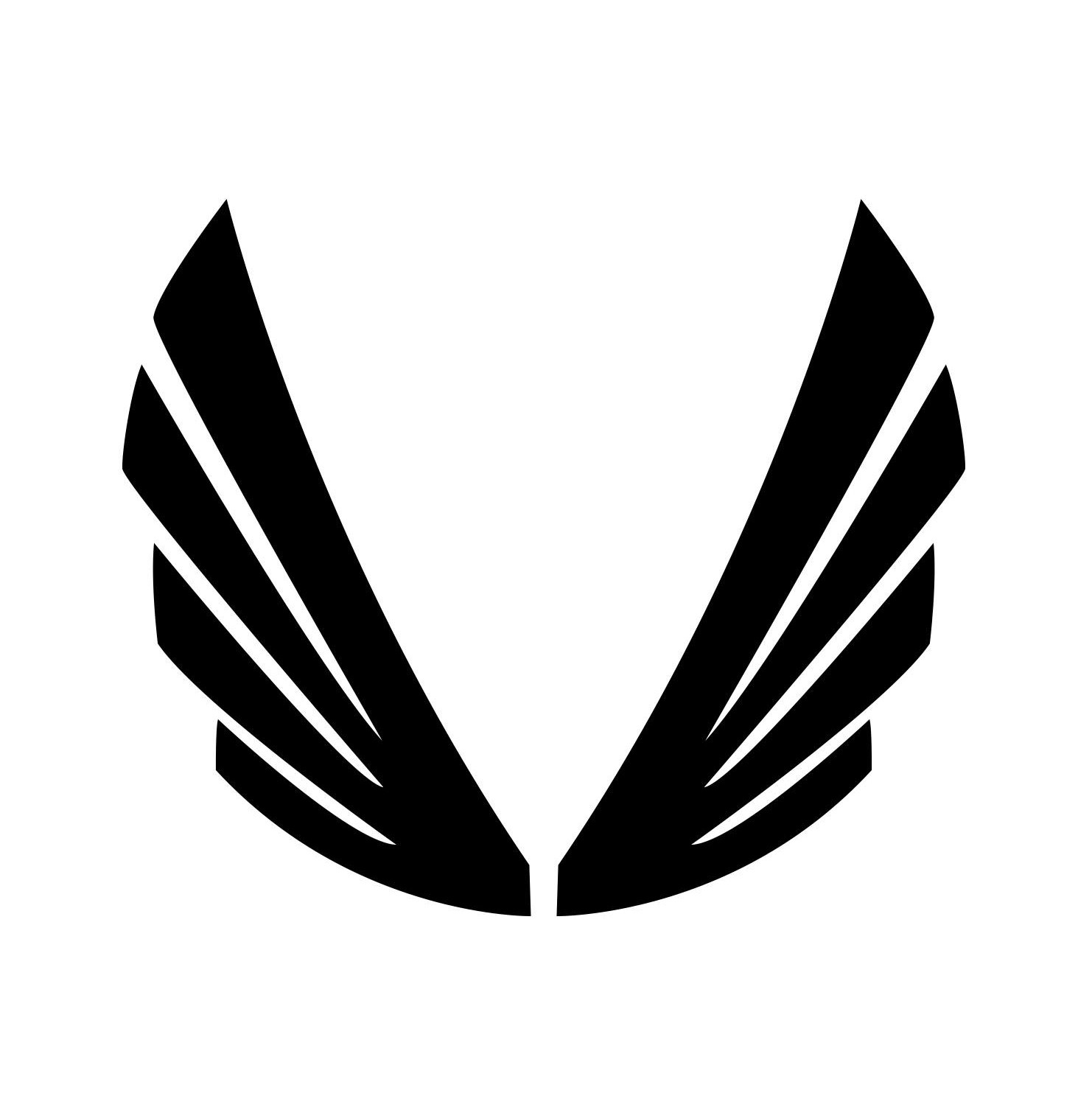
Designed for legibility across any surface, the Route badge retains its sharpness and impact while showcasing our signature Sorrento Blue—recognizable at a glance, anywhere it appears.
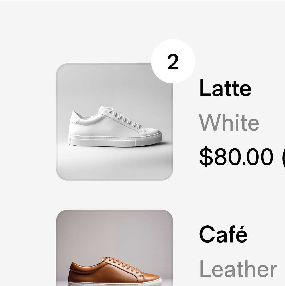
Refine your search with AI

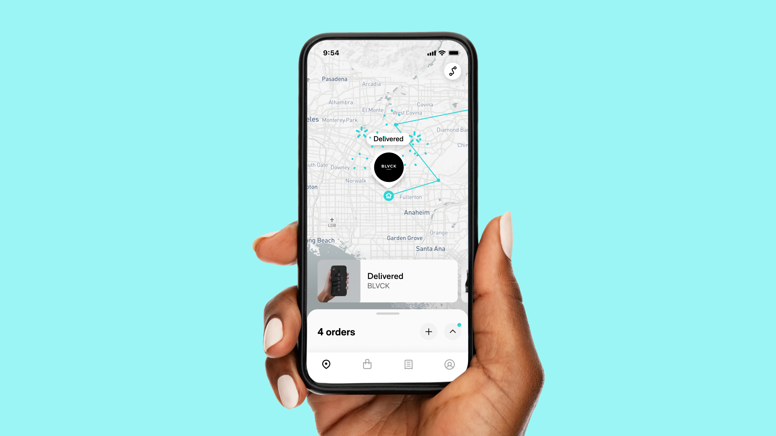
Mobile
Our design system is optimized for seamless mobile experiences. Every element—from typography to touch targets—is crafted for clarity, responsiveness, and ease of use, ensuring a smooth journey on any screen.

Delivered
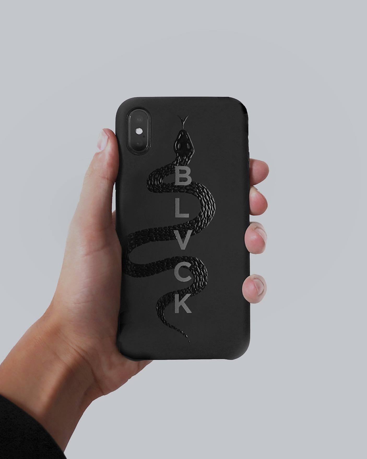
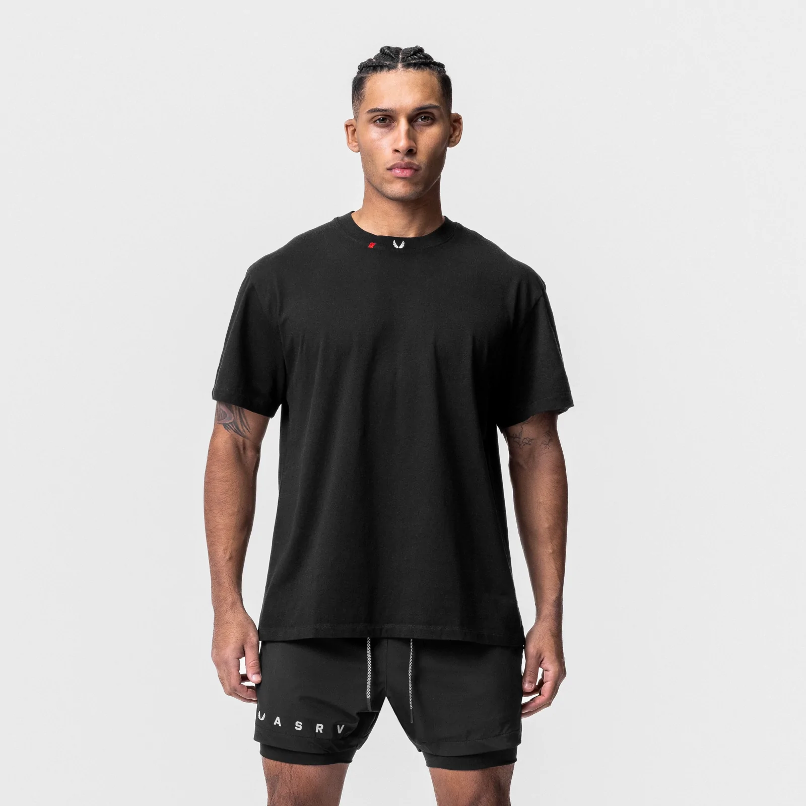
BLVCK
4 items
Arrives Tomorrow
BLVCK
4 orders


9:54


Delivered
686

New Order

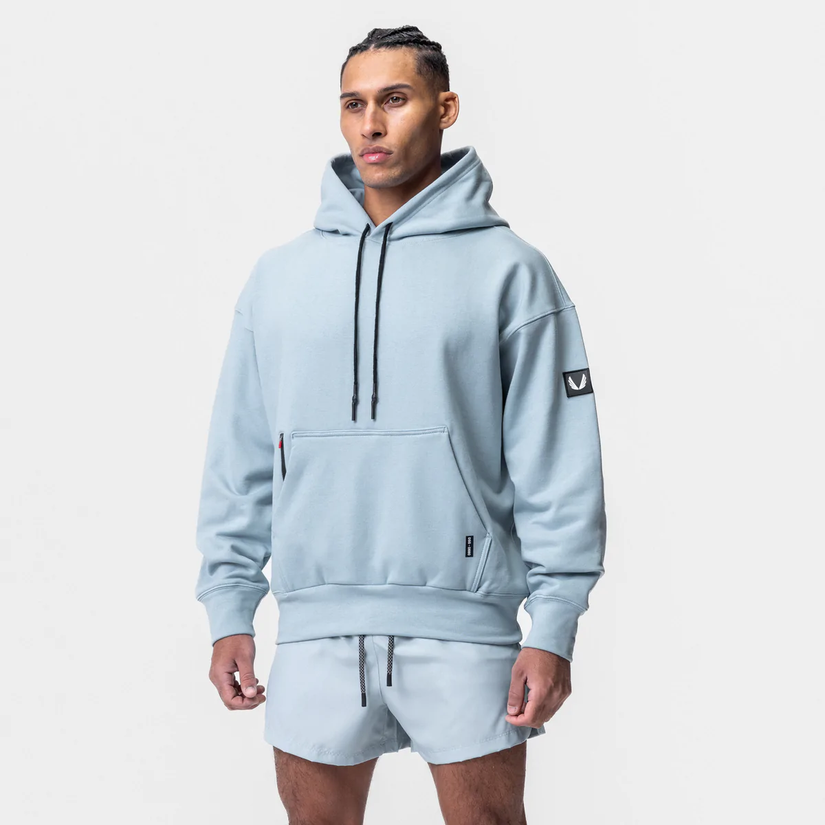
ASRV
In Transit
Arrives Thursday
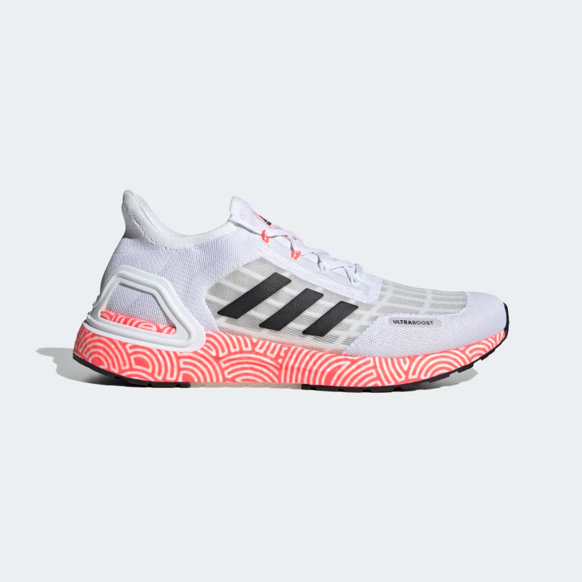
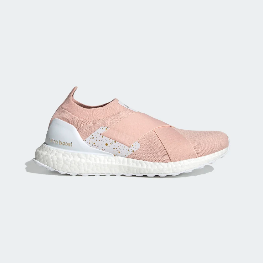
Adidas
Shipping
Arrives Mar 29

Protected

Carbon Neutral
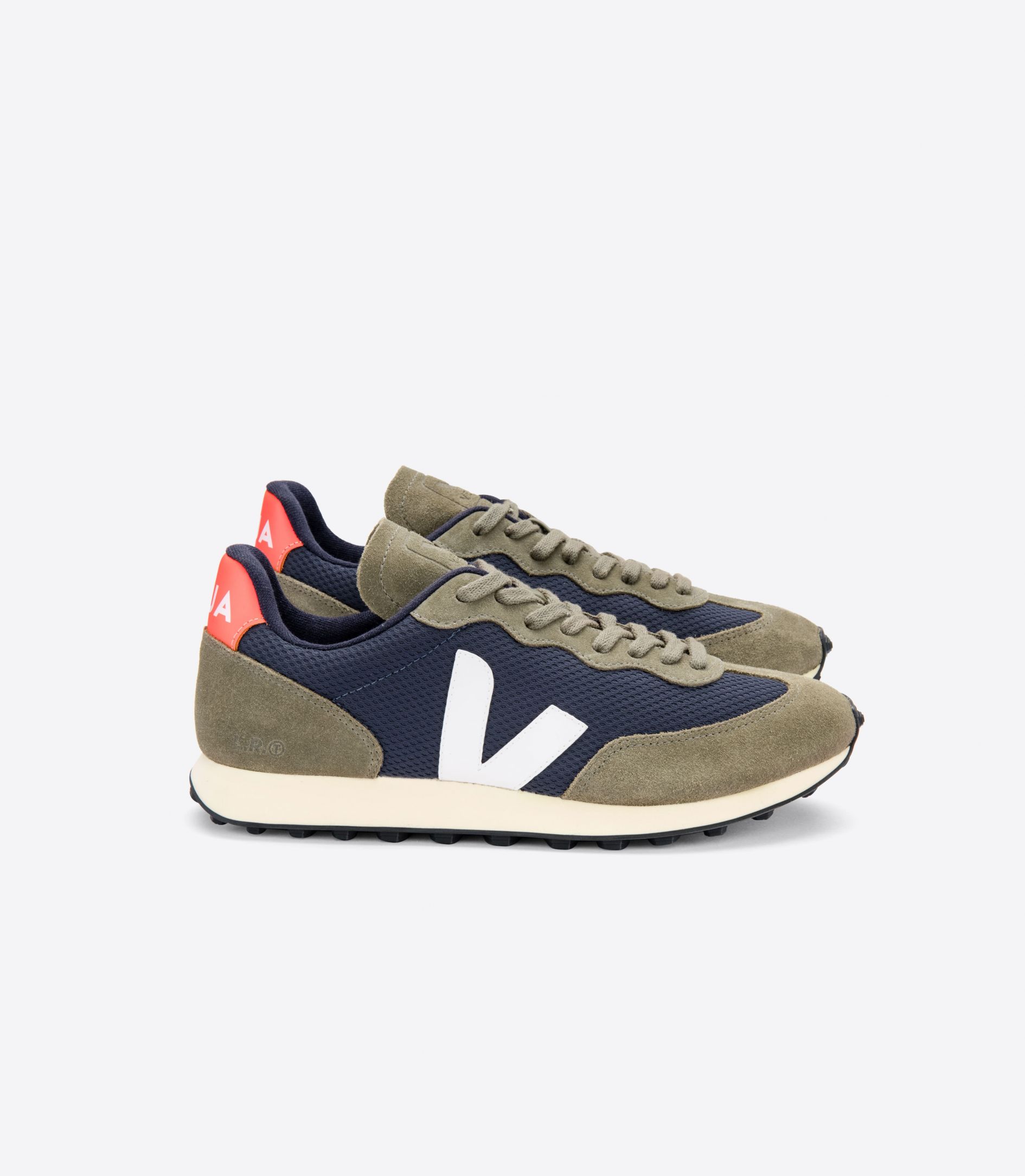
Veja

Out for Delivery
Arrives today

2
9:54

Orders


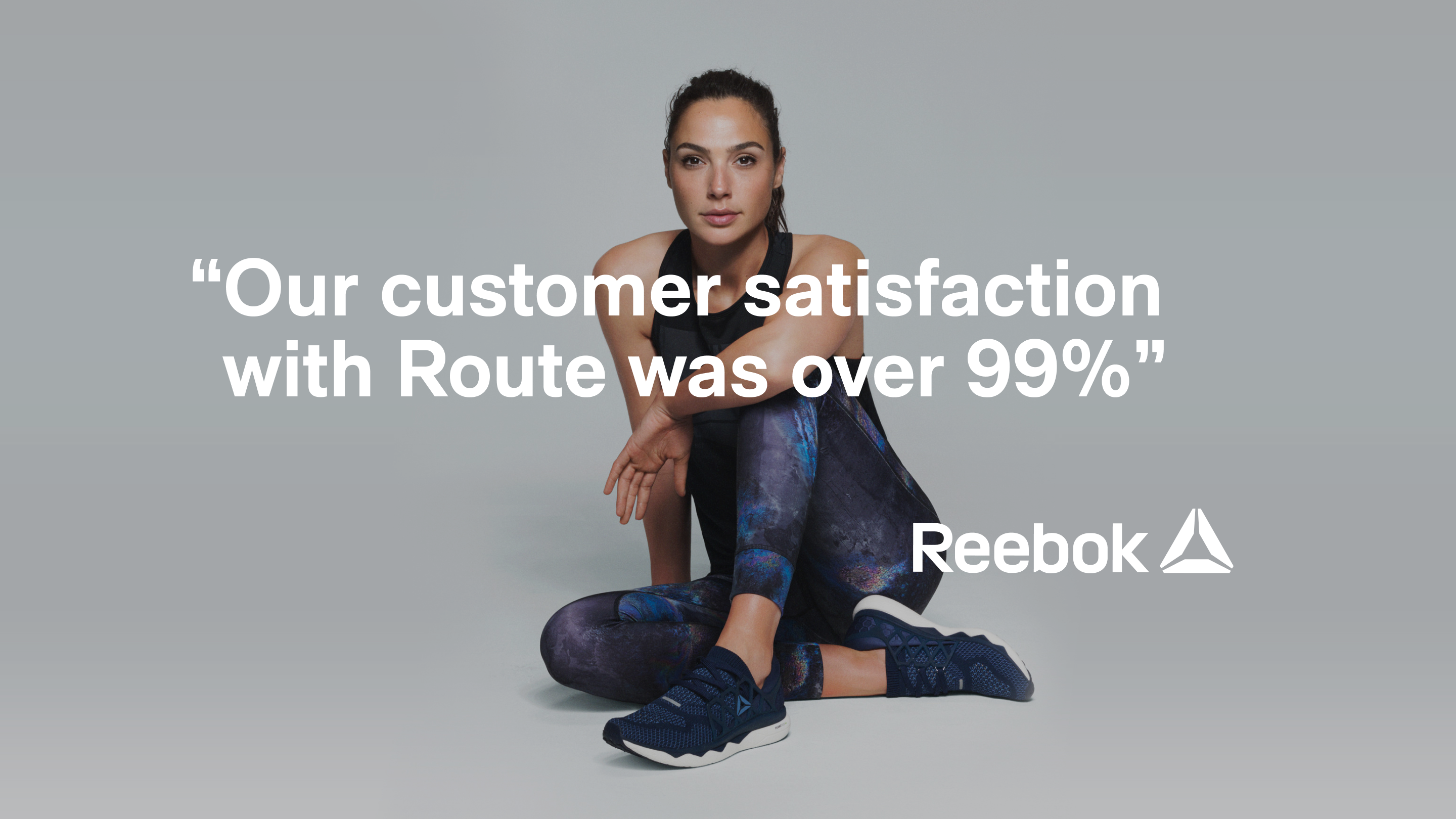
Learnings and results